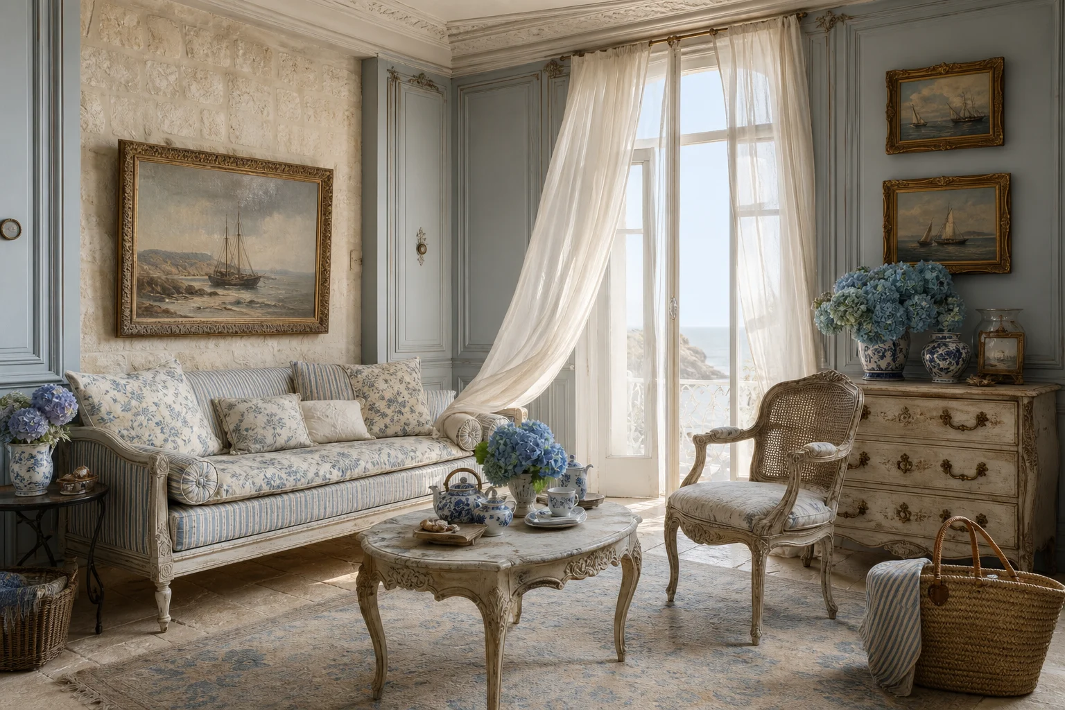
There is a version of coastal decor that involves rope, oars, and the word "NAUTICAL" printed on a cushion. This is not that.
French coastal is about light and restraint. The blues are greyed and dusty rather than navy or turquoise. White is warm, never stark. And crucially, the references are architectural — shutters, worn plaster, ribbed glass — rather than thematic. Nothing on the wall should announce that you are near the sea.
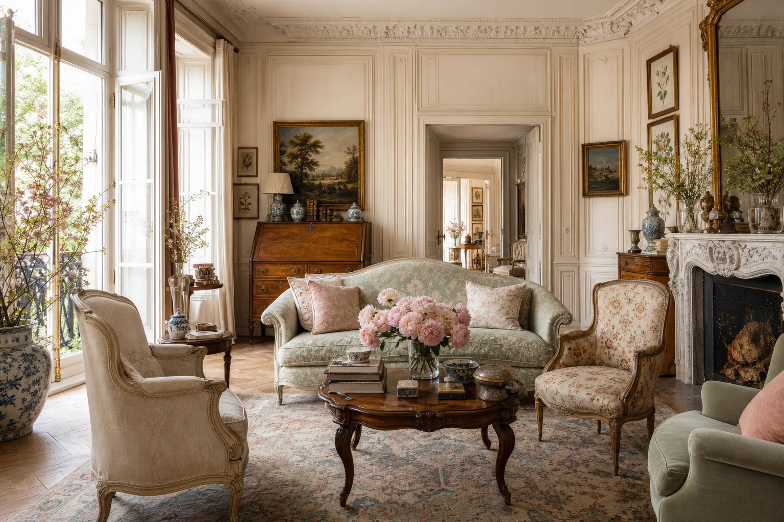
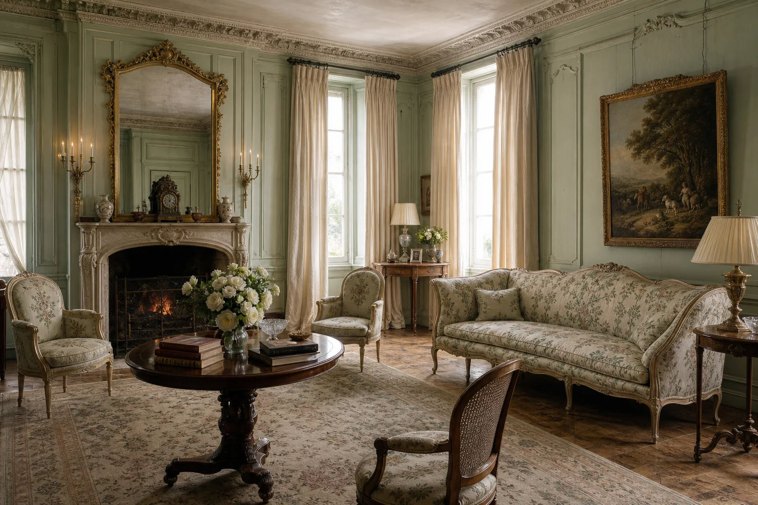
The reason I keep this as a separate collection rather than folding it into French country is the temperature. Both are warm and collected, but coastal lets more light in and uses roughly half as much pattern.
The one rule worth following
Pick one blue and stay with it. The most common failure in this look is three or four different blues in the same room, which reads as accidental rather than considered. One dusty blue, repeated three times in different materials, will always look more expensive than three blues used once each.