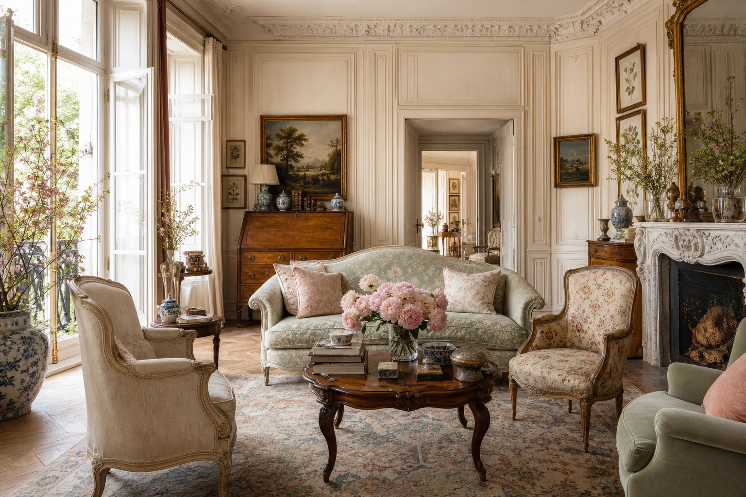
Almost every badly-styled console table has the same problem, and it is not the objects. It is that everything on it is roughly the same height. Three medium things in a row reads as a shelf; the same three at three different heights reads as a composition.
The second problem is symmetry. A perfectly balanced console looks like a hotel lobby. European rooms get their charm from being slightly off — weight pushed to one side, one thing leaning rather than standing. Below is the arrangement I keep coming back to, and the specific mistakes worth avoiding.
The rule of three (and thirds)
Great vignettes are built in groups of odd numbers — usually three. Divide your console visually into thirds and give each zone a job: one tall element, one grounding element, and one small accent. Odd numbers feel natural and collected; even numbers can look stiff and symmetrical.
Layer in three heights
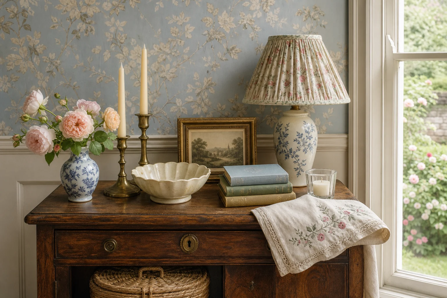
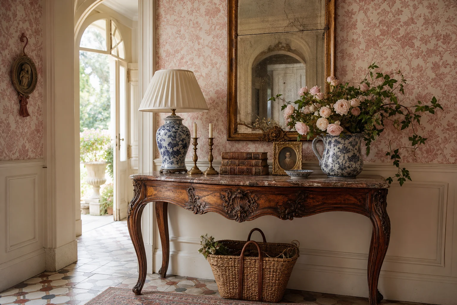
Vary your heights so the eye travels. A classic trio: a tall lamp or leaning artwork at the back, a medium vase or stack of books in the middle, and a low bowl, tray, or box at the front. This triangular composition is the single most useful trick in styling.

French Country Chinoiserie Table Lamp
A blue-and-white ceramic lamp supplies the tall point, pattern, and warm light in a classic three-height console arrangement.
View on AmazonAffiliate link — I may earn a commission.Anchor with something horizontal
A stack of two or three linen-bound or vintage books grounds the arrangement and adds a subtle horizontal line. Bonus: they double the height of whatever you set on top (a small vase or a stoneware bowl).

Textured Stoneware Vase
A softly textured vase creates the medium-height layer and leaves room for seasonal stems.
View on AmazonAffiliate link — I may earn a commission.The Weekly Edit
One email a week — new finds, seasonal styling, and the pieces I'd actually put in my own home. No spam, unsubscribe anytime.
Add art and a mirror
Lean a framed vintage print or hang a simple mirror above the console to give the vignette a backdrop and bounce light around the room. In a narrow European entryway, a mirror also makes the space feel twice as large.

Ornate Gold Wall Mirror
An ornate mirror gives the vignette an architectural backdrop and reflects light through a narrow entry.
View on AmazonAffiliate link — I may earn a commission.Bring in something living
Every good console has one organic element — a branch of eucalyptus, a small olive tree, or seasonal stems in a simple vase. It softens the hard lines and keeps the arrangement from feeling static.
Style it, then remove one thing. The empty space is what makes the rest feel intentional.
Leave breathing room
The most common mistake is overcrowding. Once your vignette looks "done," take one object away. That final edit — and the negative space it creates — is exactly what makes a European console look calm and curated rather than cluttered.
A quick console checklist
- Group in odd numbers (aim for three)
- Vary heights: tall, medium, low
- Anchor with a horizontal stack of books
- Add a mirror or leaning artwork behind
- Include one living element
- Edit down — leave breathing room
Ready to shop the look? Everything above lives in our curated finds, and you can go deeper with How to Style a European Living Room.